I’ve been working on the overall design step by step, alternating between coding and looking. I want to incorporate my calorie intake after 6 PM. I’m not recording the times I ate and I suspect they influence my whole sleep. So the most logical position is to circle all around the “sleep circles”. There is a lot of difference in daily intake after 6 PM, ranging from zero to 900 calories so far. I wanted to plot every calorie so they would have to change sizes depending on the amount. I also wanted to spread the calories evenly around the entire circle. How to go about that? Fortunately, I’ve found this great tutorial. The code is deprecated and the feed doesn’t seem to work any more but I managed to recycle the code concerning the plotting of the elements in a circle.
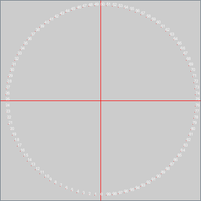
The code uses translate and rotation, which (for me) are very hard to grasp concepts. So instead of using the dots in the design I used numbers to get insight into how the elements are placed on the screen.
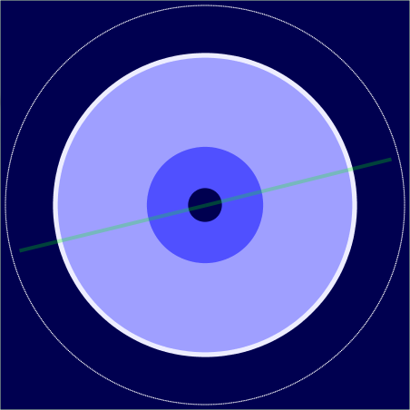
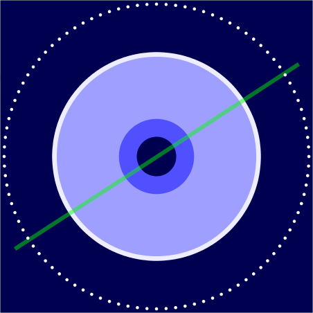
By keeping the size of the calorie circle constant, you can already see relations between the sleep duration, the amount of calories eaten and recovery.
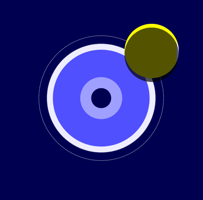
In the design you can also see an eclipse. These are the stress and happiness values for the whole day. I poll them by picking a number between 1 and 7 in the form at the end of the day. The mood is the bright circle. The stress circle covers the brightness depending on the amount of happiness felt during the day. By vertically changing the position, I can create a crescent. This can turn into a smile or a frown. The opacity of the black circle indicates the amount of stress. I’m coding this at the moment.
It’s interesting to see how each part builds on the last. Do you think this will be a good way to quickly see correlations before things that potentially affect sleep?
Hi Sergey, thanks for your comment. I’m not sure how useful the visualisation will be 🙂 I also want it to be interesting to look at. I suppose if I’m looking for correlations it would be easier to use a statistics program. But I’m hoping to have the best of both worlds, arts and insight.
I think it will be both visually and actionably interesting. The human brain is great at picking up on patterns. Can’t wait to see what’s to come!
Hi Sergey, thanks for that, that sure keeps me going 🙂