Data visualisation
I’ve been rethinking what visualisation is. My aim is to give an impression of air quality in a friendly way. Living things tell about their state in obvious ways. When you blush it tells me something about how you feel. When a tree is big and green it tells me it’s healthy. By the shape of a flower I can tell if it’s blooming or dying. A knot in a handkerchief tells me not to forget something.

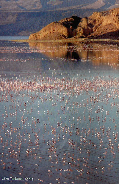
I’ve been interested in flocksand random shapes for a long time. They also say something, display a state but in an even more mysterious way. But they speak for themselves, very organically.


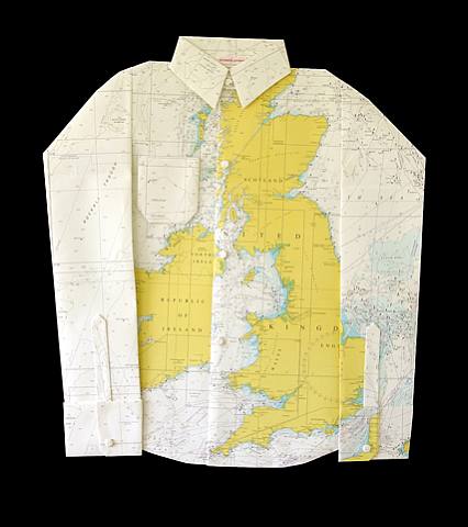
I want my wearable to be intimate and close to the body. Simple and plain like a wrist watch or a quick reminder written on my hand. Or a scribble in a notebook. The most simple and direct way for us to visualise data, any data, pencil and paper.


Materials
We also had to think about the materials we want to use. When I think about visualising data, the first thing that springs to mind is pencil and paper. Make a garment you can actually log on…
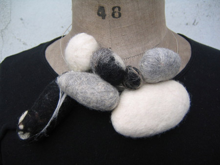
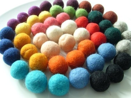
As I was also thinking about making a nature like shape which can change, felt is a nice choice.
I thought it would be nice not just to measure pollution but give something back… oxygen 🙂 It can go something like this
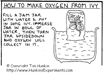
Or this:
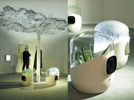
A great design by Mathieu Lehanneur.