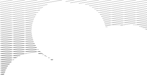
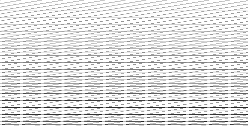
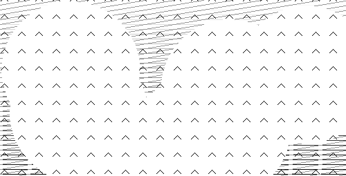
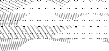
I’ve been experimenting with the design and data visualisation using the personal data values: mood, stress, energy level and inner peace. Depending on the data value the lines, shapes and tone of each visualisation varies. This will create a different structure for every timeslot in every day.
Inner peace will be a big organic and mysterious shape.
Energy and stress level will be pictured using horizontal an vertical lines respectively. The upper image is average energy and stress level. The lower is low energy and high stress.
Mood will be an arrow head/smiley pointing upwards or downwards. It is the most upper layer, clearly visible on the peace shape.
This is an experiment with combined output for 4 timeslots using real data. It gets a bit busy and the lines in different directions are making me feel a little giddy. So work to be done but it’s a promising start.
