There were still a couple of variables to visualise once the basics design was ready. I had to work on integrating my pre-sleep activity. In the end I used three activity types: sport, social and screen (computer and television). Of the first two I’d logged duration by recording start and finish time. For screen time I just logged total duration because it was often scattered.
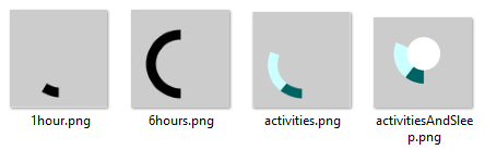
I was looking for a way to display all aspects (type, start, finish and duration) in a way that fitted with the nice, round shapes I’d been using so far. Then I realised the pre-sleep activities were recorded from 18:00h onwards. So the main circle could act as a dial. I could split up the space from 18 till 23:59 using the activity duration. I calculated the starting position of each activity as a degree on the dial and added the minutes the activity lasted. Using the arc shape with a substantial line thickness resulted in nice, bold strokes around my “night” circles. Each activity type has its own colour.
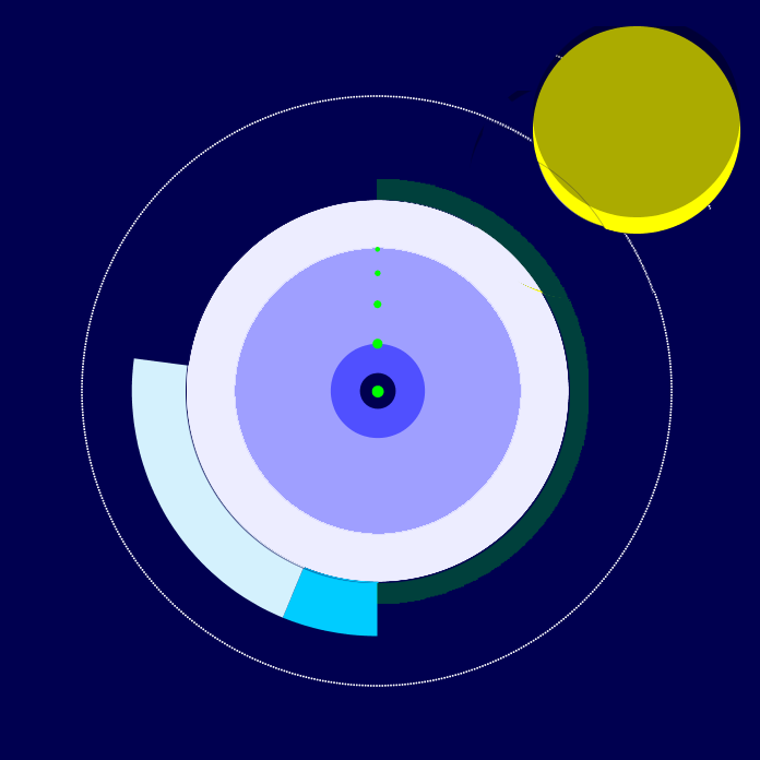
I was happy with the result but then the recovery line just looked plain ugly. I decided to use the same arc shape on the other side of the circle. The more recovery the thicker the stroke in green. The less recovery the thicker the line in red.
Finally there was the subjective rating of the sleep. I think it is important to incorporate how the night felt for me. Emfit uses a star system from 1 to 5 stars. So I played around with stars, ellipses and other shapes but finally settled on simple golden dots. A five star night would have the fifth and biggest dot in the middle of the deep sleep circle, this seemed fitting.
When the individual nights were finished it was time for the overall poster design. I somehow had got it into my head that this would be easy. But it was quite hard the capture the look and feel I was aiming for. I wanted the poster to be simple so that the individual nights would stand out and make a nice “galaxy”. On the other had I did want a legend and some explanation of what was on display.
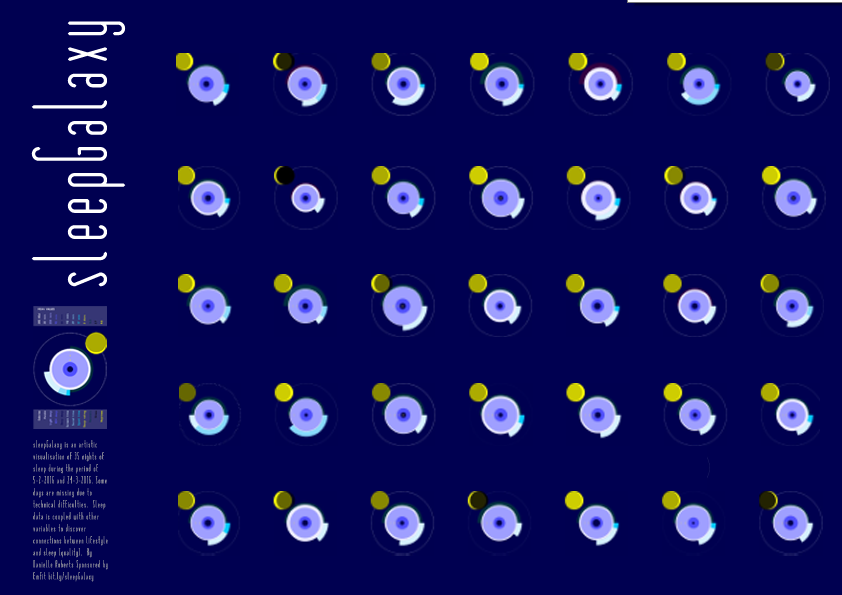
My first idea was to go for a size of 70 x 100 cm, the nights would have a size of around 10 cm. This was too small for all the details to be visible. My final poster will be 91 x 150 cm. The nights are big enough and they all have enough space on the sheet while it is still possible to compare them. I found the nice, slim font Matchbook for the title, the legend and text. I’ll be sending the pdf to the printer next week.