Introducing Silence Suit

first sensors
Meditation stool with soft sensor and heart-rate sensor

For over a year I’ve been working on a meditation wearable. It measures biometric and environmental input. Its goals is to use the measurements to improve your meditation and use the data to generate artistic visualisations. The wearable is part of a bigger project Hermitage 3.0, a high-tech living environment for 21st century hermits (like me). Now that the wearable project is taking shape I’d like to tell a little about to process of creating it.

The sensors
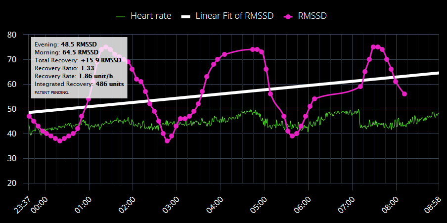
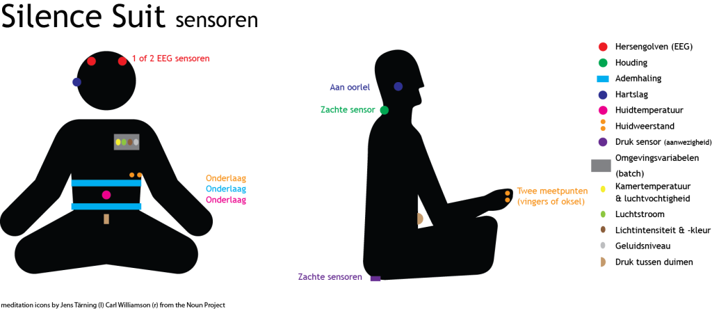
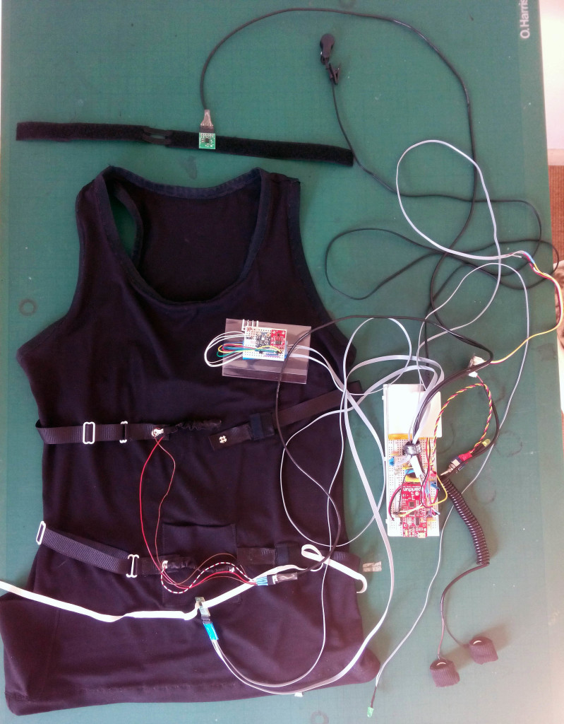
I started with a simple but surprisingly accurate heart-rate sensor. It works with the Arduino platform. It uses an ear-clip and sends out inter beat intervals and beats per minute at every beat. With some additional code in Processing I can calculate heart-rate variability. These are already two important measures that can tell a lot about my state while meditating. Then I added galvanic skin response to measure the sweatiness of my skin, a nice indicator of stress or excitement. I added an analogue temperature sensor that I put on my skin to measure its temperature. Low skin temperature also indicates a state of relaxation. I also made a switch sensor that is attached to my meditation stool. Sitting on it indicates the start a session, getting up marks the end.
All sensors were connected with a wire to my computer but the aim was, of course, to make it wireless so I’d be free to move. But I could already see day to day changes in my measurements.

A little help from my friends
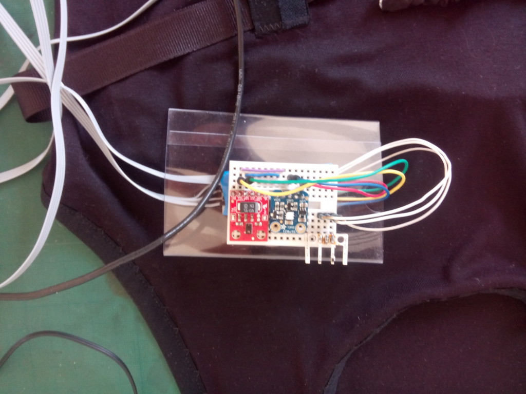
As things were becoming more complex I posted a request for help in a Facebook group. A colleague, Michel offered to help. We first looked at different ways to connect wirelessly. Bluetooth was a problem because it has very short range. Xbee also wasn’t ideal because you need a separate connector. We also made a version where we could write to an SD card on the device. But this of course doesn’t offer live data which was crucial for my plans. We finally settled for WiFi using the Sparkfun Thing Dev ESP8266. We were going to need a lot of analogue pins which the thing dev doesn’t offer. So we used the MCP3008 chip to supply 8 analogue i/o pins.

Overview of all the sensors

More is more
We could then increase the amount of sensors. We’ve added an accelerometer for neck position, replaced the analogue skin temperature sensor with a nice and accurate digital one. Around that time a wearable from another project was finished. It is a vest with resistive rubber bands that measures expansion of the chest and belly region. Using the incoming analogue values I can accurately calculate breath-rate and upper and lower respiration. Then it was time to add some environmental sensors. They give more context to for example GSR and skin temp readings. We’ve added room temperature and humidity, light intensity and RGB colour and air flow.

Vest with sensors
Vest with sensors
Environmental sensors

Seeing is believing
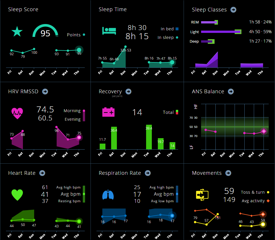
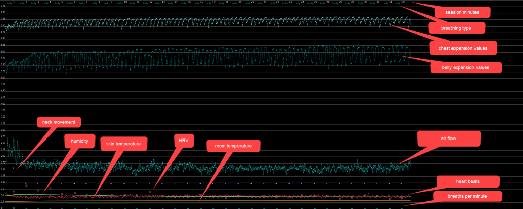
From the start I’ve made simple plots to get a quick insight into the session data. For now they don’t have an artistic purpose but are purely practical. At this point it is still essential to see if all sensors work well together. It’s also nice to get some general insight into how the body behaves during a meditation session.
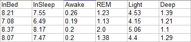
Data is also stored in a structured text file. It contains minute by minute averages as well as means for the whole session.

Session data plot with legend

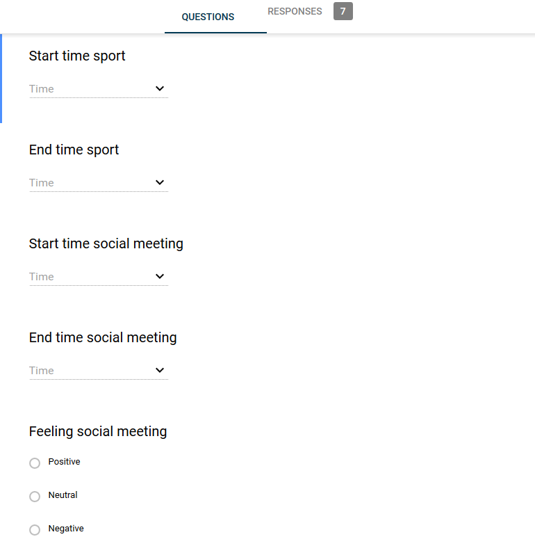
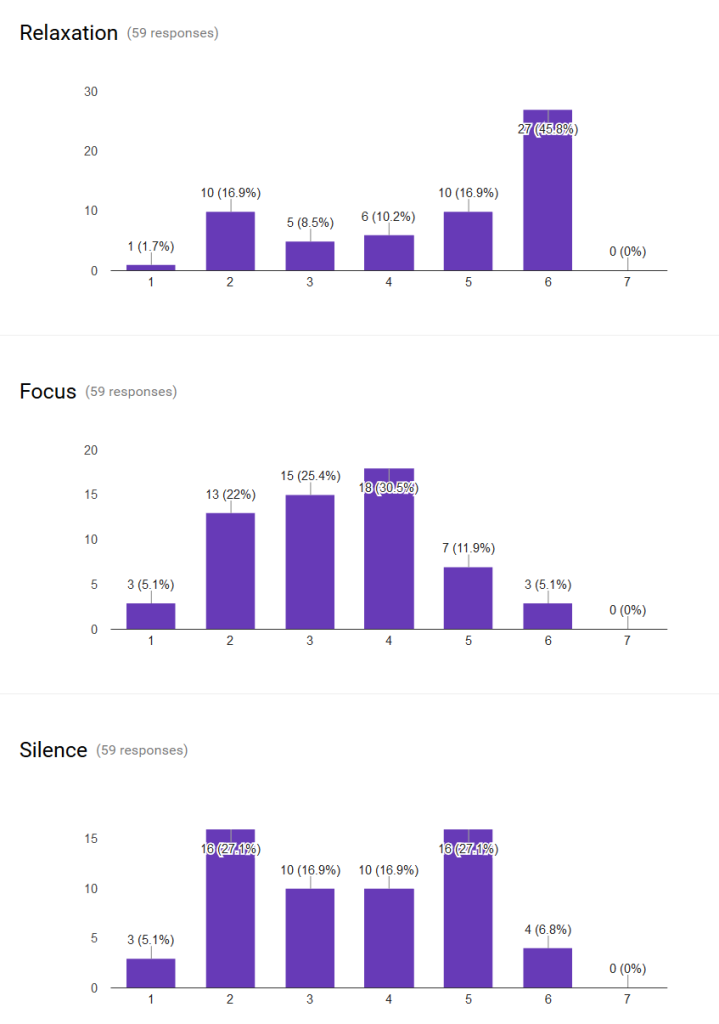
I’ve also made a Google form to track my subjective experience of each session. I rate my focus, relaxation and perceived silence on a 7 point likert scale and there is a text field for a remark about my session.
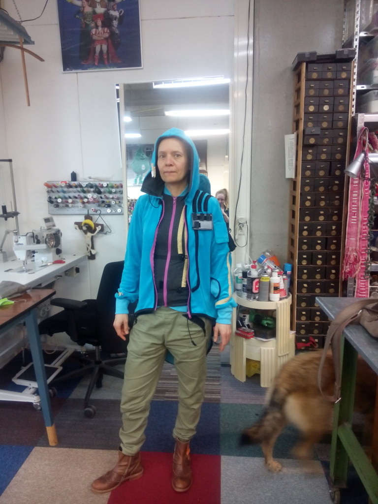
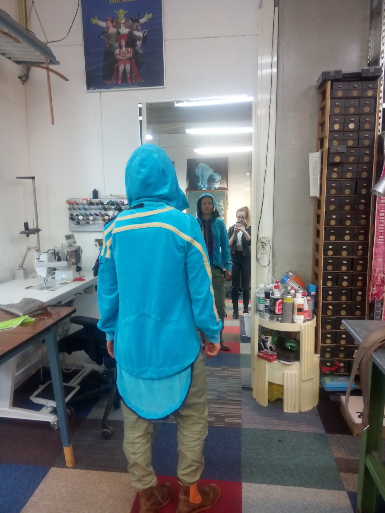
Results from Google form: very relaxed but not so focussed...
Results from Google form: very relaxed but not so focussed…

Suit
I used the vest from the other project to attach the sensors to. But last week costume designer Léanne van Deurzen has made a first sample of the wearable. It was quite a puzzle for her and her interns to figure out the wiring and positioning of every sensor. I really like the look of this first design. It’s fits with the target group: high-tech hermits and it also is very comfortable to wear.

Upper and lower part of the suit
Back with extension where soft sensors to detect sitting will be placed

The future
The next step will be adding sensors for measuring hand position and pressure and a sound-level sensor.
Then we will have to make the processing board a bit smaller so it can fit in the suit. We can then start integrating the wiring and replacing it by even more flexible ones.
When all the sensors are integrated I can really start looking at the data and look for interesting ways to explore and understand it.
I’m also looking for ways to fund the making of 15 suits. That way I can start experiments with groups and find ways to optimise meditation by changing the environment.

Pitch for The Big Date Hackathon

I was invited to pitch at a hackathon hosted by the GGD. The topic was: Data citizens: using quantified self to improve health? I got a lot of positive feedback on my pitch so I want to share it here.

I have a dream…
But then I wake up.
I’m lying in my bed, my Emfit QS sleep sensor has logged my sleep phases, heartrate and movements. Todays’ sleep score is 86 points. But how did I sleep according to me? For one I already feel quite stressed because of some issues at work.
I take my morning blood pressure reading and sure enough the blood pressure has risen.
I hope some meditation will help. I put on my meditation monitoring gear and meditate for 30 minutes. Later I can see from my log that my heart rate came down. And I’m glad the whirlwind of thoughts has dropped.
Every morning I’m curious about my current weight. So I step on my Aria Wi-Fi scale, hmm. Yesterday I had a beer and some peanuts and it shows: weight has gone op by 0.4 kg and fat percentage by 0.1. But I can make a new start every day.
So let’s continue with a healthy breakfast: banana 83 gr, 74 kcal, orange 140 gr, 69 kcal, kiwi fruit, 75 gr, 46 kcal. After that a nice, warm oatmeal with extra fibre, apricots, flax seeds and soy milk: a total of 360 kcal.
Now I’m ready for work! My project timer logs the minutes I spend on different projects and the Workpace software makes sure it take my breaks on time.
After lunch (498 kcal) it is time for my walk in the afternoon sun. 4731 steps. Still more then 5000 to go.
In the evening, after a workout and a nice diner I check my energy balance, 1966 calories in and 1856 calories out. I try and burn a little bit more and take an evening stroll.

After some stretch exercise I head of to bed. And then I have a dream:
I’m travelling on a train. A nice and professional looking lady takes the seat next to me. She says: “I’ve been watching you. I see you very often, almost every time I take the train. I’ve got a feeling I know you pretty well. I know you have a very conscious lifestyle: your diet is healthy, you take enough exercise and your BMI is perfect. I estimate your biological age to be around 12.5 years younger than your chronological age. But still, you sleep poorly from time to time and your fat percentage as well as your concentration during meditation fluctuate. Please let me tell you what you can do to further optimise your health.” She bends over and starts whispering in my ear. I can’t make out everything she says but a sense of insight, purpose and control fills me. I lean back in my chair and a feel happy and relieved.

As we’re entering a tunnel she gets up and sits down opposite an elderly, overweight woman with a walking stick by her side. Slowly the young professional transforms into a kind granny as she takes out some knitting from her bag. She starts a conversation with the other woman, about arthritis if I’m not mistaken. Then I wake up.

I had a dream. In this dream all the fragmented pieces of data that I collect about my body and behaviour were translated into actionable information, explained to me in a language I can understand. I had insight into what my next steps should be and what path to follow to keep on track and to further improve my health. I received some true health wisdom.
Now I’m a media artist, I work with data, I program, make visualisations and use statistics. But even for me it is not clear what actionable conclusions I can draw from my data. A visualisation doesn’t necessarily lead to insight let alone advice on how to improve my lifestyle.

And look at the elderly lady. She got her information in a way that was appropriate for her. The oracle answered questions and gave advice fitting to this individual based on a deep understanding of all the data available.

But… it was a dream.
I challenge you to come up with solutions on how to combine data sets, generate knowledge from it and translate it into plans and advice people can really work with. Solutions that are transparent and respect the choices and privacy of the users.
I challenge you to make my dreams come true this weekend.

The big date
The big date hackathon, picture by MAD


working on numuseum

After a long time I’ve taken up the numuseum website. It’s been nagging me for ages that it’s so outdated and not working properly any more. I’m keeping it simple but will be implementing some new things.

design
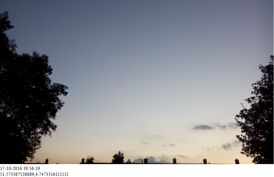
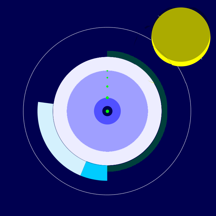
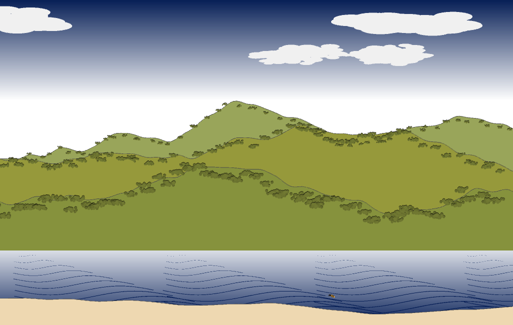
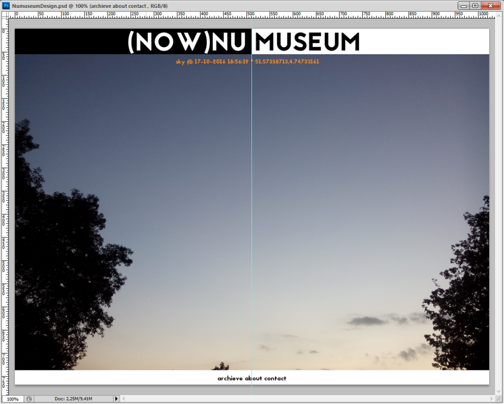
I want to create a now part (“nu” means now in Dutch) and a museum part. Now always shows the most recent data. I’ll start of with a picture of the sky with time and location data. I will overlay that with personal data like mood and heart rate. The museum part will show the now part history in some interactive way.

I’ve found a cute, free font Jaapokki Regular that I’ll be using for the website.

The menu at the bottom gives access to the archive of net-art pieces, an about and contact page.

I’ve already started coding the sky part. I use a very neat FTP app (AndFTP) to send the sky pictures to the server. A PHP script sorts the pictures (most recent first) and grabs the date-time and locations data (from EXIF headers).

home

sleepGalaxy: final design

Displaying different activities with the right duration and start time

There were still a couple of variables to visualise once the basics design was ready. I had to work on integrating my pre-sleep activity. In the end I used three activity types: sport, social and screen (computer and television). Of the first two I’d logged duration by recording start and finish time. For screen time I just logged total duration because it was often scattered.
I was looking for a way to display all aspects (type, start, finish and duration) in a way that fitted with the nice, round shapes I’d been using so far. Then I realised the pre-sleep activities were recorded from 18:00h onwards. So the main circle could act as a dial. I could split up the space from 18 till 23:59 using the activity duration. I calculated the starting position of each activity as a degree on the dial and added the minutes the activity lasted. Using the arc shape with a substantial line thickness resulted in nice, bold strokes around my “night” circles. Each activity type has its own colour.

The final night design (rating still in green)

I was happy with the result but then the recovery line just looked plain ugly. I decided to use the same arc shape on the other side of the circle. The more recovery the thicker the stroke in green. The less recovery the thicker the line in red.

Finally there was the subjective rating of the sleep. I think it is important to incorporate how the night felt for me. Emfit uses a star system from 1 to 5 stars. So I played around with stars, ellipses and other shapes but finally settled on simple golden dots. A five star night would have the fifth and biggest dot in the middle of the deep sleep circle, this seemed fitting.

UFO like rating design

When the individual nights were finished it was time for the overall poster design. I somehow had got it into my head that this would be easy. But it was quite hard the capture the look and feel I was aiming for. I wanted the poster to be simple so that the individual nights would stand out and make a nice “galaxy”. On the other had I did want a legend and some explanation of what was on display.

Sketch of the poster design

My first idea was to go for a size of 70 x 100 cm, the nights would have a size of around 10 cm. This was too small for all the details to be visible. My final poster will be 91 x 150 cm. The nights are big enough and they all have enough space on the sheet while it is still possible to compare them. I found the nice, slim font Matchbook for the title, the legend and text. I’ll be sending the pdf to the printer next week.

Sleep statistics

Let me start with some characteristics of my sleep pattern. My mean hours of actual sleep is 7.19, of which 20.4% is REM sleep, light sleep 60.1%, deep sleep 15.7%. According to the Emfit QS website my REM sleep is on the low end and my light sleep on the high end needed for complete recovery. I suppose that’s why I often don’t feel really fit when I get out of bed. On average I spend 7.89 hours in bed.

I’ve been looking at the correlations between the sleep and context variables, using data from 35 nights. I’ve also included some other variables that I’ve measured during the same period. I’ll discuss some of the significant correlations I’ve found.

correlationsTable

There are some surprises here. Eating in the evening doesn’t seem to be the healthiest thing to do. It lowers my HRV and prevents deep sleep. I’ve stopped eating after diner.

Deep sleep in minutes. The graph makes very clear that having zero calories leads to the most minutes of deep sleep.

The effect of sleep on blood pressure was also an eye-opener. When I sleep better the blood pressure lowers again.

My subjective sleep appreciation correlates positively and highly significant with all sleep phases and the time spend in bed as well as actually sleeping. It has no correlation to deep sleep though. I’ve heard people say that this is the main determinant for their perceived sleep quality. For me this seems to be just sleeping. To crank up my REM and light sleep I should allow myself to spend more hours in bed, there is a strong correlation.

All the other variables don’t affect my sleep. This could be due to them not occurring very often/not every night. I’ve looked at overall stress and happiness. They don’t seem to be connected to any of the sleep parameters. Happiness is positively correlated to the minutes I work out. This is of course often demonstrated in research but it was nice that it sneaked into this unrelated dataset.

Contrary to what I expected the following variables have no significant bearing on my sleep phases: social activity, meditation and evening screen time. Meditation I usually do in the mornings so I can imagine that the effect wears off. But screen time doesn’t affect my sleep contrary to what is claimed. Maybe that’s because I watch boring stuff 😉

sleepGalaxy: design & calories

Design
Design

I’ve been working on the overall design step by step, alternating between coding and looking. I want to incorporate my calorie intake after 6 PM. I’m not recording the times I ate and I suspect they influence my whole sleep. So the most logical position is to circle all around the “sleep circles”. There is a lot of difference in daily intake after 6 PM, ranging from zero to 900 calories so far. I wanted to plot every calorie so they would have to change sizes depending on the amount. I also wanted to spread the calories evenly around the entire circle. How to go about that? Fortunately, I’ve found this great tutorial. The code is deprecated and the feed doesn’t seem to work any more but I managed to recycle the code concerning the plotting of the elements in a circle.

calorieViz1
Plotting numbers instead of dots

The code uses translate and rotation, which (for me) are very hard to grasp concepts. So instead of using the dots in the design I used numbers to get insight into how the elements are placed on the screen.
By keeping the size of the calorie circle constant, you can already see relations between the sleep duration, the amount of calories eaten and recovery.

cals2
Evening with a lot of calories
cals1
Evening with less calories

In the design you can also see an eclipse. These are the stress and happiness values for the whole day. I poll them by picking a number between 1 and 7 in the form at the end of the day. The mood is the bright circle. The stress circle covers the brightness depending on the amount of happiness felt during the day. By vertically changing the position, I can create a crescent. This can turn into a smile or a frown. The opacity of the black circle indicates the amount of stress. I’m coding this at the moment.

Bewaren

sleepGalaxy: recovery

As I explained in my previous post I find the recovery measurement very useful. It seems a good representation of how rested I feel. It is calculated using RMSSD. The Emfit knowledge base explains it like this: “… For efficient recovery from training and stress, it is essential that parasympathetic nervous system is active, and our body gets sufficient rest and replenishment. With HRV RMSSD value one can monitor what his/her general baseline value is and see how heavy exercise, stress, etc. factors influence it, and see when the value gets back to baseline, indicating for example capability to take another bout of heavy exercise. RMSSD can be measured in different length time windows and in different positions, e.g. supine, sitting or standing. In our system, RMSSD is naturally measured at night in a 3-minute window during deep sleep, when both heart and respiration rates are even and slow, and number of movement artifacts is minimized…” Here is an example of how recovery is visualised in the Emfit dashboard:

Emfit dashboard
Emfit dashboard

I looked for a way to integrate this measure in a way fitting with my “planet metaphor”. I’ve chosen a kind of pivot idea. It vaguely reminds of the rings around planets.

Using the mouse pointer to enter different values of recovery

I thought it would be easy to just draw a line straight through the middle of the circles. I wanted it to tilt depending on the height of the score. It was harder then expected. I ended up using two mirroring lines and vectors. Starting point was the excellent book by Daniel Shiffman, The nature of code.

Integrating with circle visualisations.

Once I got the basics working, I went on to refine the way the line should look projected over the circles. Going up from the lower left corner indicates positive recovery, visualised by the green coloured line. The more opaque the better the recovery. Of course, negative recovery goes the other way around.

Slight recovery
Slight recovery

The is a difference in the starting points from which the recovery is calculated. Sometimes my evening HRV is very high. This results in a meagre recovery or even a negative recovery. I might think of an elegant way to incorporate this in the visual. May be I have to work with an average value. For the moment I’m still trying to avoid numbers.

Almost maximum recovery
Negative recovery
Negative recovery

sleepGalaxy: kick off

Finally, I’ve started to work on a piece that’s been on my mind for almost two years. Ever since I met the nice people from Emfit at the Quantified Self conference. They kindly gave me their sensor in return for an artwork I would make with it.

Emfit QS
Emfit QS sleep sensor

You put the sensor in your bed, go to sleep and it wirelessly sends all kinds of physiological data to their servers: movement, heart rate, breath rate. All this data together they use to calculate the different sleep stages. From the heart rate they’ve recently started calculating HRV and recovery. This latter value to me is best indicator of my sleep quality and how energetic I feel.
Emfit offers a nice interface to explore the data and view trends.
emfitInterface

In sleepGalaxy I want to explore the relationship between sleep quality and the following variables: exercise, social and work meetings, calorie and alcohol intake, screen time and overall happiness and stress during the day. I’m under the impression that these have the most impact on my sleep, that is, the sleep phases, the ability to stay asleep and recovery.

Google form
Google form

To track the variables I’ve created a Google form that I fill in every night before I go to sleep. I’ve set an alarm on my iPad so I don’t forget.

Excel sheet with some of the Emfit data
firstNight
First circle visualisation

From all the Emfit data I’ll be using a subset. My first sketches focus on the sleep phases. I’ve spend a couple of hours programming first the basic idea: transforming the sleep phases into concentric circles. Going from awake to light sleep, REM sleep and deep sleep in the centre.

The next step was to make sure the different phases are displayed correctly, representing the amount of time spend in each phase and total time in bed. I’m programming in Processing and I’ve created an class called Night. After reading in the Emfit excel data as a csv file I loop through the rows and create a night object representing every night.
Displaying the circles went fine but the proportions between the circles just didn’t look right. I realised I had a conflict working with minutes in a decimal context. I wrote a little function that converts the minutes of the hours into decimal values and then adds them to the whole hours:
float min2dig(String time){
String[] tmp = split(time,'.');
float t = float(tmp[0])+(float(tmp[1])/60);
return t;
}

Now the basis of the visualisation is ready. The image below displays sleep phases of the four nights in the excel data from above. I look forward to adding more data. To be continued…
firstNights

Quantified Self Europe conference 2015

As always, I was very much looking forward to the conference. The program looked promising and I hoped to meet QS pals. And because I was giving an Ignite talk and testing my Virtual View installation with updated software (view below.) This is an account of the most striking things I heard and saw.

QSEU15ByStevenKristoffer

The how-to sessions were new. I suppose they’re great for subjects which are limited in scope. Like the one on meditation tracking by Gary Wolf. The idea that just tracking time and duration of your meditation sessions can give you insight into how your life is going was refreshing. I’ve got an idea to automatically log my sitting periods. This session has given it a new boost.

There were some sessions on HRV. I went to the one Marco Altini gave together with Paul LaFontaine. I got some useful information on the two modes of tracking: PPG (60 seconds in the morning) or situational tracking. Both have their specific uses. The Polar H7 belt is most reliable and comfortable for the latter as you can wear it for long periods. It was nice to see how Paul did many experiments combining datasets of activities (e.g. phone logs) with HRV data. The session was a nice intro but I would have liked more hands on information. But I talked with Marco later during the office hour. If I just want to measure global, all day changes in heart rate a device like the Fitbit Charge HR would also do. Marco was wearing one and was satisfied with it. He’s the expert, it’s on my whish list…

I really liked that the show & tell talks were programmed on their own. It gave a lot less choice anxiety. The one on speed-reading by Kyrill Potapoc was a real revelation. I’ve already installed the Spritzlet browser extension. As a dyslectic, any improvement in my reading speed is welcome.
I also enjoyed the way Awais Hussain approached datasets that already existed to gain insight in causal chains and decision points. All this in aid to get best start for the future. I think it is a poetic approach.

I skipped one breakout to stroll around the tables during the Office hour. This made me very happy. Emmanuel Pont has developed the Smarter Timer app. It lets you track you activities at room level using differences in strength of Wifi networks. It is a learning app so you can teach it your activities in certain places. A desktop app will also track your software use. Exactly what I need! And a big improvement from the piece I did way back in 2008 “Self portrait @ home“. (I scanned QR-codes every time I entered an room.)
I also had a nice chat with Frank Rousseau from Cozy. An open source platform that allows you control over your own data. If offers similar functionality to the Google suite (mail, calendar, file sharing, etc.) I’m trying it out at the moment. I hope that I’ll be using it on my own server one day.

Ellis Bartholomeus

Ellis Bartholomeus told a very refreshing story about her hand drawn smiley’s. She treated the little drawings as data and discovered much about her moods. It was nice to watch the different stages of her process of getting to grips with what icons to use and how to interpret them.
Jakob Eg Larsen shed some interesting light on one of my favourite topics: food logging. I liked the simplicity of his approach to just photograph one meal a day, his dinner. It was funny how he struggled with the aesthetics of the food. It made me wonder: how much do the colours of your food tell you about their nutritional value?
One of the most amusing and at the same time personal talks was from Ahnjili Zhuparris. She was looking for correlations between her menstruation cycles and other aspects of the life like music and word choice. Not all clichés appear to be true. Female cycles caused some complaining among a few of the male attendants. Moderator Gary Wolf dealt with that in a compassionate but effective way. I was very impressed.

Jakob Eg  Larsen

Reactions to the Virtual View installation

During the Office hour and at the end of the day people tried out the installation. I had 14 users in total. Of course I logged some general data 😉
I logged baseline heart rate and the lowest heart rate achieved during the experience after the baseline was set. The mean heart rate is calculated over each animated wave. A wave lasts 7.5 to 13.75 seconds depending on the frequency spectrum data. The mean baseline heart rate was 79,68 and the mean lowest heart rate was 68,01. The difference between these two means is significant. There was quite some variation between users: the maximum heart rate during baseline was 96.08 the minimum was 54.76 resulting in a big difference of 41.3. The variation in lowest pulse during the experience was between 80.07 max. and 50.45 min. resulting in a difference of 29.6.
For me it was good to see that even in relaxed circumstances using Virtual View results in a reduction of heart rate. Every user showed reduction, the average reduction was 14% with a maximum of 32%!

Still from the animation

I’m really happy to have received valuable feedback. These are some of the remarks that stood out. Overall users really liked the installation and found it relaxing. A couple of people expected an end to the animation. But a view doesn’t have a beginning or end. I should find a way to make it more clear that people can leave at any time.
Even though I’ve improved the feedback on heart rate some people would still like a little more information about it. For example their baseline measurement at the start of the animation.
The use-case of daycare with difficult children or people under stress like refugees, was suggested.
One of the users said it would be nice to have sheep on the hills. I really like that idea. They shouldn’t be too hard to draw and animate. Their moving speed could for example also give an indication of heart rate.
There were some requests for Virtual Reality devices but I still don’t think this is a suitable technology for patients in healthcare institutions, the main target group.

Apart from the content, there’s always the social aspect which makes the QS conferences such great experiences. People just feel uplifted by the open and tolerant atmosphere, the sense of learning and sharing that we all feel. I can’t wait for next conference to come to Europe.

Virtual View: building the installation

During the discussion with the hospitals it became clear that I couldn’t just put my stuff in a room and leave it there, especially as the space was open to the public all day. So I had the idea of building a piece of furniture that would act both as a chair and a chest for the hardware. As it seemed rather complex to integrate everything in a foolproof manner, I contacted DIY wizard Aloys.

We discussed the basic requirements and decided on a building a sketch first on which we could improve in a future version. Of the essence was integration of PC, sound system, beamer and heart-rate sensor. It had to be stable and elegant at the same time. The chair also should act as an on-off switch, detecting user presence. Of course time and budget was limited. So Aloys first made a CAT drawing. He also made a cardboard sketch.
CAT drawing of installation
I wanted the operation of the installation to be simple, a one switch interface to switch the complete installation on and off. We managed that using a rod to prod the big switch of the PC, this acted as a primitive key for the staff. Aloys also provided a lock so I could open the chair and get to the hardware and electricity supply if that was needed. The mouse and keyboard were also locked the chair, making it impossible to stop the program without the rod key.
full view of installation
The installation showed a static image of the animation is no one was using it to attract attention, also some wind sounds are heard. The software saves a still every minute so a different image appears after each use. Once a user sits down (detected by a hardware switch using Arduino) she is prompted to attach the clip of the sensor to her earlobe. When the sensor is detected the animation and soundscape starts. The speakers are integrated in the chair and create a very spacious and lifelike sound. This creates a strong sense of presence. Users can stay and enjoy the installation for as long as they like.
When they get up the animation freezes and the sounds mute except for the soft wind sounds.

animation from user perspective

Most people found the experience relaxing and enjoyable. Some software issues emerged that I’m solving now. The chair was not very comfortable so that is something we will work on in the next version. Users weren’t very clear how the heart-rate was visualised. I’m improving that, creating more links between the audiovisuals and the physiological data without distorting the landscape feeling.
I also want the next version to be more mobile. That way I can easily take it for a demonstration.